Exploring Asset Allocation With Mathematica
An important idea in passive investing is asset allocation. This is the science (or art) of combining different classes of assets in order to reduce overall risk without affecting return. In this article we’ll look at how to measure and combine different asset classes to create an ‘optimal’ portfolio using Mathematica.
Risk v Reward
Some asset classes are historically more risky than others. For example, stocks typically experience large up-and-down swings, but on average give a high return on investment. On the other hand, bonds generally give a much steadier but much lower return. The following chart shows the return of the global stock market, VTI (blue) versus the US bond market, BND (purple) from June 2010 to now.
Clean[a_] := NormalizeToOne[#[[2]] & /@ a]; (* extract closing data *)
NormalizeToOne[a_] := a/First[a];
dateRange = {"2010-06-01", "2012-12-20"};
totalGlobalStock = Clean[FinancialData["VT", dateRange]];
totalUsBnd = Clean[FinancialData["BND", dateRange]];
ListLinePlot[{totalUsBnd, totalGlobalStock}, PlotStyle -> Thick, ImageSize -> {500}]
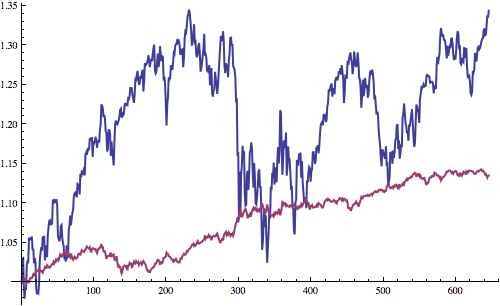
You can see that with stocks it’s much easier to buy and sell at the wrong time, whereas with bonds your potential losses are likely much less. Furthermore, if you look at the graph, you’ll notice that when stocks have a really bad day, bonds often go up. This means that if we invest in both stocks and bonds, we help reduce risk, because if one has a bad time, the other will likely make some gains to cancel out the losses. In mathematics, this is something called correlation and is an important part of portfolio management - choose a selection of assets that help balance each other out. For example, we might choose a portfolio of US stocks and non-US stocks. Here is a graph showing the daily return % of US stocks versus non-US stocks for all trading days from June 2010 to now:
totalNonUsStock = Clean[FinancialData["VEU", dateRange]];
totalUsStock = Clean[FinancialData["VTI", dateRange]];
DailyReturns[a_] := 100*(a/Prepend[Drop[a, -1], First[a]] - 1);
ListPlot[Transpose[{DailyReturns[totalUsStock],
    DailyReturns[totalNonUsStock]}], ImageSize -> {500}]
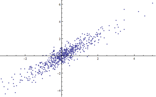
Correlation[DailyReturns[totalUsStock], DailyReturns[totalNonUsStock]]
0.935178
These two assets are highly correlated with a correlation factor of 0.94. When one has a high daily return, we can see the other also has a high daily return %. This means that although we have a high potential return from this portfolio, if one asset doesn’t do well, chances are the whole portfolio will do badly and we’ll lose a lot of money. Conversely, here is the same chart comparing the global stock market and the US bond market for the same time period:
ListPlot[Transpose[{DailyReturns[totalGlobalStock],
    DailyReturns[totalUsBnd]}], ImageSize -> {500}]
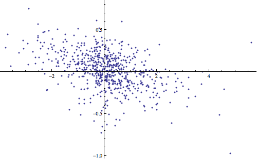
Correlation[DailyReturns[totalGlobalStock], DailyReturns[totalUsBnd]]
-0.467528
Global stocks and US bonds have a negative correlation factor of -0.47. This means that when one goes up, the other will probably (but not certainly) go down.
So how can we combine these two in order to increase return and lower our risk? Let’s imagine we create 100 different portfolios, the first with 0% bonds and 100% stocks, the second with 1% bonds and 99% stocks and so on. We then measure the risk (which we’ll quantify as the standard deviation) versus the reward (the total return over the measured time period) and plot the portfolios on a chart like so:
RiskReward[a_] := {StandardDeviation[a], Last[a] - First[a]};
WeightedPortfolio[w_, a_] := Total[#] & /@ Transpose[w*a];
portfolios =
  WeightedPortfolio[{#, 1 - #}, {totalGlobalStock, totalUsBnd}] & /@ Range[0, 1, 0.01];
portfoliosRR = RiskReward[#] & /@ portfolios;
ListLinePlot[portfoliosRR, PlotStyle -> Thick,
  AxesLabel -> {"Risk", "Return"}, ImageSize -> {500}]
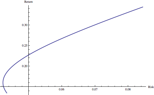
We can see that rather than there being a straight line from safe bonds (where the line starts in the bottom left) to unsafe but rewarding stocks (where the line ends in the top right corner), the graph instead takes a curve, meaning that it gets less risky as you add stocks, before becoming riskier again as the stocks outweigh the bonds - why is this? - well as we saw before, stocks and bonds are negatively correlated, meaning if you have a few stocks and the rest in bonds, when bonds dip, stocks will rise, cancelling out those losses. In fact, the best risk v reward ratio occurs when you have 77% US bonds and 23% global stocks - the technical name for this is the efficient frontier. Unfortunately this only gives you a return of 17% over three years, equivalent to an annualised return of 5.4% a year. Lets see if we can do better by introducing other asset classes.
Asset Classes
There are hundreds of different types of investments available to investors these days. We only need to consider ones that are loosely correlated - this is because if all our investments move the same way, we might as well just buy the same thing - we want our investments to cancel out loses when one of them has a bad day. Typical types of assets in portfolios are:
Different Countries (ie Stocks from the US, non-US developed countries, emerging markets)
Large versus Small stocks
Growth versus Value stocks
REITs (Real estate)
Precious Metals (eg gold and silver)
Different Sectors (ie, healthcare companies, financial companies etc)
Bonds (can be government or corporate, short-term or long-term)
Vanguard is a company that has conveniently packaged a number of these indexes into low cost ETFs (exchange traded funds) that can be bought and sold through brokers. I’ve chosen the following Vanguard ETFs to create an ‘optimal’ portfolio:
Lets see how these different symbols correlate with each other by creating a table showing the correlation of each symbol with every other symbol:
symbols = {"VEA", "VWO", "VTV", "VUG", "VV", "VO", "VB", "VNQ",
    "BSV", "BIV", "BLV", "GLD", "SLV"};
prices = Clean[FinancialData[#, dateRange]] & /@ symbols;
dailyReturns = DailyReturns[#] & /@ prices;
correlations =
  Outer[Correlation[#1, #2] &, dailyReturns, dailyReturns, 1];
Grid[Prepend[MapThread[
    Prepend[#1, #2] &, {Round[#, 0.01] & /@ correlations, symbols}],
    Prepend[symbols, "-"]], Frame -> All, Alignment -> Left]]
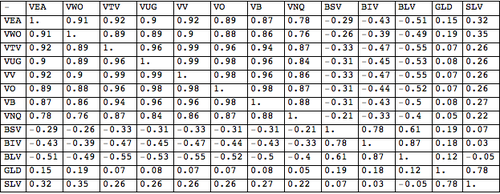
We can see that stocks (symbols starting with ‘V’) highly correlate with each other, as do bonds (starting with ‘B’), as do metals (SLV and GLD). Furthermore, bonds and stocks are loosely negatively correlated, and metals don’t seem to correlate with either stocks or bonds.
What about the risk v reward for each of these?
riskRewards = MapThread[
    Prepend[{StandardDeviation[#1], Last[#1] - First[#1]}, #2] &, {prices, symbols}];
Show[ListPlot[#[[{2, 3}]] & /@ riskRewards,
  PlotStyle -> PointSize -> Large, ImageSize -> {500},
  PlotRange -> {{0.0, 0.35}, {0.0, 0.65}},
  AxesLabel -> {"Risk", "Return"}],
  Graphics[Text[#[[1]], 1 #[[{2, 3}]] + {0, 0.02}] & /@ riskRewards]]
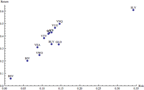
We can see that they all follow the expected trend of more risk = more reward. Interestingly, although silver (SLV) has the greatest reward, it is also insanely risky. For that reason, and because it’s closely correlated with gold anyway, I’m going to remove it from the portfolio. Furthermore, medium-sized companies (VO) seem to simply represent a mix of small and large companies in terms of their correlations with other assets. If I can get the same return by mixing these two, then I can drop medium-sized companies. Dropping VO and SLV leaves the following eleven assets:
Asset Allocation
So how can we choose the right combination of assets for our portfolio? This is where Mathematica’s numerical optimisation shines.
WeightedPortfolio[w_, a_] := #/First[#] & @@ { (Total[#] & /@ Transpose[w*a])};
Goodness[w_, a_] := (Last[#] - First[#])/StandardDeviation[#] & @@ {WeightedPortfolio[w, a]};
NMaximize[{Goodness[{vea, vwo, vtv, vug, vv, vb, vnq, bsv, biv, blv, gld}, prices],
  vea >= 0 && vea = 0 && vwo = 0 &&
    vtv = 0 && vug = 0 && vv = 0 && vb = 0 && vnq = 0 &&
    bsv = 0 && biv = 0 && blv = 0 && gld  PointSize -> Large, ImageSize -> {500},
    PlotRange -> {{0.0, 0.16}, {0.0, 0.6}},
    AxesLabel -> {"Risk", "Return"}],
  Graphics[Text[#[[1]], 1 #[[{2, 3}]] + {0, 0.02}] & /@ riskRewards]]
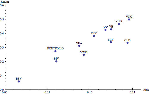
We can see that although the risk this is very similar to intermediate-term bonds (BIV), we actually enjoy a 35% higher return. Looking at the individual components, we get the following:
- 45% bonds, with a slight emphasis on short and intermediate term.
- 10% emerging markets
- 30% non-US developed world equities
- 6% US growth stocks
- 6% US small-cap stocks
- 3% gold
- 4% US real estate
- minimal US value stocks and large-cap stocks.
The following graph shows our portfolio (blue), compared to the global stock market (purple), and the US bond market (yellow)
ListLinePlot[{wp, totalGlobalStock, totalUsBnd }, PlotStyle -> Thick, ImageSize -> {500}]
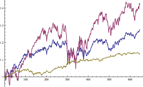
What’s interesting is the relative lack of US equities. The date range chosen (June 2010 till now) can have a huge impact on correlations, and therefore asset allocation optimisations - generally the longer the period the more accurate the optimisation, since there is more data. However many of these ETFs are only a few years old, limiting the available data (unless one wants to generate the index manually). Time-period sensitivity is something I’d like to look into in the future as I learn more about portfolio management and computational investing. Inspiration for this post came from Tucker Balch’s online course Computational Investing (available on Coursera).