DIY Hedge Fund Analysing Wikipedia Edits as a Trading Strategy
About a year ago, a story went around tech and finance media about a hedge-fund that used Twitter data for sentiment analysis called Derwent Capital Markets. It worked so well in fact that they closed the fund in order to productize their services for the mass-market.
Inspired by Derwent Capital Markets, in this article I’ll examine another valuable online source: Wikipedia. My aim is to analyse Wikipedia edits and compare these to stock price events. Let’s see how it goes…
Choosing the stocks
The more data there are to play with, the easier it will be to pull out trends. The Dow Jones Industrial Average has 30 of the largest US companies so they’ll do nicely.
Opening up Wikipedia
If you’ve had the pleasure of using Ruby and haven’t yet tried Nokogiri, check it out. It’s an HTML/XML parser that makes web scraping, dare I say it… fun. First let’s get the list of articles we want to inspect:
require 'nokogiri'
require 'open-uri'

# open the article about the Dow Jones Index
doc = Nokogiri::HTML(open('http://en.wikipedia.org/wiki/Dji'))
companies = []
# find the first sortable table (the list of companies)
doc.css('table.sortable')[0].css('tr').each do |row|
  if row.css('td')[0]
    name   = row.css('td')[0].css('a')[0].text
    symbol = row.css('td')[2].css('a')[0].text
    href   = row.css('td')[0].css('a')[0]['href']
    # push the company name, symbol and wikipedia url into our companies array
    companies.push Hash[:name, name, :symbol, symbol, :url, "http://en.wikipeda.org#{href}"]
  end
end
Now that we have a list of articles to scrape we want to look at the edits. If you click on one of the articles, you can click ‘view history’ to see a list of edits. Then you can click ‘500’ to see the 500 most recent edits. Notice the 500 appears in a RESTful URL in the string &limit=500. Can we get even more recent edits by changing this? Yup - about 5000 will do. This means we need to change a URL of the form:
http://en.wikipedia.org/wiki/3M
Into the form:
http://en.wikipedia.org/w/index.php?title=3M&offset=&limit=5000&action=history
We can do this with:
companies.map! do |c|
  c[:url] = "http://en.wikipedia.org/w/index.php?title=#{c[:url].split('/')[-1]}&offset=&limit=5000&action=history"
  c
end
Now that we have our URLs, let’s get scraping. For each edit we have the following data:
- Date and time
- Size of edit (# characters added or removed)
- User/IP address
- Edit comment (optional)
For now let’s just get the absolute size of the edit and the date and time. We can do this like so:
companies.map! do |company|
  puts "Getting data for #{company[:name]}..."
  doc = Nokogiri::HTML(open(company[:url]))
  edits = []
  doc.css('#pagehistory li').each do |li|
    if li.css('.mw-changeslist-date').text != ""
      date = Time.parse li.css('.mw-changeslist-date').text
      size = li.css('.mw-plusminus-neg, .mw-plusminus-pos, .mw-plusminus-null').text.gsub(/[^\d]/, '')
      edits.push Hash[:date, date, :size, size]
    end
  end
  company[:edits] = edits
  company
end
Once we’ve done that we’ll dump our data into a CSV file. We can pass the file name as a command line argument to our Ruby script:
CSV.open(ARGV[0], "wb") do |csv|
  companies.each do |company|
    company[:edits].each do |edit|
      csv  ","];
(* turn into SYMBOL, NAME, DATE STRING, YEAR, MONTH, DAY, EDIT SIZE *)
data = Flatten[{#[[2]], #[[1]],
        StringSplit[#[[3]]][[1]],
      ToExpression[#] & /@ Take[StringSplit[#[[3]],{"-", " "}], 3],
      ToExpression[#[[4]]]}] & /@ data;
(* drop all data before 2009 and after 2012 *)
data = Select[data, #[[4]] >= 2009 && #[[4]]  500]

Converting this to a table so we can see which are the most “controversial” (or “active” depending on your perspective) companies, we get:
Grid[Prepend[Reverse[counts], {"Symbol", "Name", "Edits 2009-2012"}], Frame -> All]
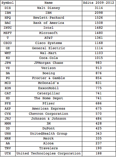
Well there are certainly some boring companies out there. In case you were wondering, UTX is an American multinational conglomerate that owns Pratt and Whitney (jet engines) and Otis (elevators) among others. TRV is a big insurance company, and AA produce aluminium. If I were being paid to do this I would probably want to look at each subsidiary of each of these mega-corps and check their wikipedia edit frequencies. However I’m not, so I won’t.
What about the wikipedia edits generally? Let’s group the data together and see how edits looks over time:
days = {};
dayData = {};
date = {2009, 01, 01};
While[date != {2013, 01, 01},
  AppendTo[days, date];
  AppendTo[dayData,
    Select[data,
    date[[1]] == #[[4]] && date[[2]] == #[[5]] &&
      date[[3]] == #[[6]] &]];
  date = DatePlus[date, 1];];
dayEditCounts = Length[#] & /@ dayData;
dayEditCountsSMA = MovingAverage[dayEditCounts, 31];
graph = DateListPlot[
  Transpose[{Drop[Drop[days, 15], -15], dayEditCountsSMA}],
  PlotStyle -> {Thick}, Joined -> True, ImageSize -> {500}]
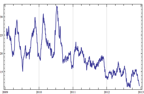
The above chart shows the 31-day simple moving average for total wikipedia edits over time for the 30 companies. What if we superimpose the DOW? Yahoo Finance which provides most of the financial data for Mathematica has stopped supporting the Dow Jones Index, so we’ll have to use an ETF, DIA instead:
dji = FinancialData["DIA", dateRange];
NormalizeWithDate[list_] := {#[[1]], #[[2]]/list[[1]][[2]]} & /@ list;
normalizedSMA = NormalizeWithDate[Transpose[{Drop[Drop[days, 15], -15], dayEditCountsSMA}]];
normalizedDJI = NormalizeWithDate[dji];
graph = DateListPlot[{normalizedDJI, normalizedSMA},
  PlotStyle -> {Thick}, Joined -> True, ImageSize -> {500}]
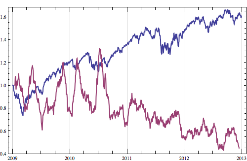
Above we have the DJI (blue) versus smoothed edits-per-day (purple). Let’s treat “normalised 31-day simple moving average of Dow Jones companies’ Wikipedia edits” as an index like any other, and see how the daily returns correlate with the Dow Jones itself. We’ll use the absolute (ie, not negative) daily returns for both because presumably Wikipedia edits are just as frantic for bad news as for good news.
commonDates = Intersection[normalizedSMA[[All, 1]], normalizedDJI[[All, 1]]];
normalizedSMA = Select[normalizedSMA, MemberQ[commonDates, #[[1]]] &];
normalizedDJI = Select[normalizedDJI, MemberQ[commonDates, #[[1]]] &];
AbsDailyReturns[a_] := Abs[100*(a/Prepend[Drop[a, -1], First[a]] - 1)];
graph = ListPlot[Transpose[{
    AbsDailyReturns[normalizedDJI[[All, 2]]],
    AbsDailyReturns[normalizedSMA[[All, 2]]]}],
  PlotStyle -> {Thick}, ImageSize -> {500}]
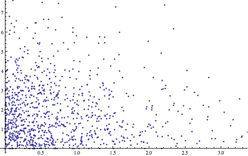
Nothing! As I should have expected, my Wikipedia Index has a negligible correlation (-0.042) with the DJI. Even if our WIkipedia index is just edits per day rather than the 31-day moving average, there is still no correlation. Oh well, let’s see if we can correlate article edits to individual company stocks.
Finding Alpha
One problem with looking at stocks is that they tend to move up and down with the market, regardless of the particular company the stock represents. The part of the stock that represents “the market” is called beta and the part that represents the “fortune” of the company itself is called Jensen’s alpha. We can see this is the case by checking the correlation of each of our 30 companies with the Dow Jones:
extraDates = Complement[dji[[All, 1]] , companyPrices[[1]][[All, 1]]];
dji = Select[dji, Not[MemberQ[extraDates, #[[1]]]] &];
Grid[Prepend[Transpose[{companyNames,
  Correlation[DailyReturns[dji[[All, 2]]], DailyReturns[#[[All, 2]]]] & /@ companyPrices}],
    {"Name", "Correlation with DJI"}], Frame -> All]
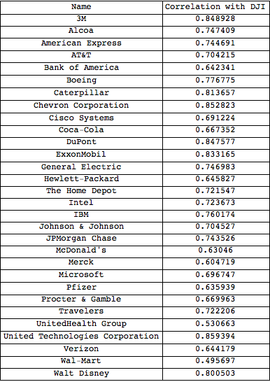
A correlation of 1 means the stock moves perfectly in sync the Dow Jones. The fact that all these are very close means that we’ll need to somehow remove the “market noise” (beta) so we can concentrate on alpha, which is what we want to compare to Wikipedia edits. Beta is defined as the covariance between the stock and the market, divided by the variance of the market. As an example here is Microsofts “alpha”:
Clean[a_] := #/First[#] &@(#[[2]] & /@ a); (* extract closing data *)
StockBeta[stock_] :=
  Covariance[DailyReturns[dji[[All, 2]]], DailyReturns[stock[[All, 2]]]] / Variance[DailyReturns[dji[[All, 2]]]]
StockAlpha[stock_] := Transpose[{stock[[All, 1]],
  DailyReturns[stock[[All, 2]]] -
  StockBeta[stock]*DailyReturns[dji[[All, 2]]]}]
FromDailyReturns[dr_] := Drop[FoldList[#1 + #1*#2*0.01 &, 1, dr], 1];
ListLinePlot[{Clean[dji], Clean[companyPrices[[22]]],
  FromDailyReturns[StockAlpha[companyPrices[[22]]][[All, 2]]]},
  PlotStyle -> {Thick}, ImageSize -> {500}]
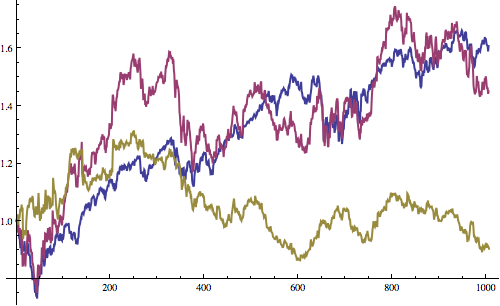
In the above graph, the Dow Jones is in blue, Microsoft (MSFT) is in purple, and Microsoft’s alpha is in yellow. We can see that MSFT combines features from both the Dow Jones and Microsoft’s alpha (we’ll call this “MSFT alpha” from now on).
Wiki Edits v Stock Prices
How does alpha change with wiki edits? Let’s have a look. Since Disney had by far the most edits (3114 between 2009 and 2012) lets start with DIS. First we’ll need to group our wiki edits data by company then by date - excluding dates in which the stocks weren’t trading:
StockAlphaWithDates[stock_] := Transpose[{stock[[All, 1]],
    FromDailyReturns[StockAlpha[stock][[All, 2]]]}];
companyAlphas = StockAlphaWithDates[#] & /@ companyPrices;
companiesDayData = {};
companiesDayCounts = {};
(* only bother with days we have DJI data for *)
commonDates = Intersection[dji[[All, 1]], days];
For[c = 1, c = 14 &]]
=> 10
Let’s plot these days on a chart along with DIS alpha and see if they match up:
highDIS = {#[[1]], If[#[[2]] >= 14, 1.3, 0]} & /@
    companiesDayCounts[[-1]];
graph = DateListPlot[{highDIS, companyAlphas[[-1]]}, Joined -> True,
  PlotStyle -> {{Black, Thick}, {Red, Thick}},
  PlotRange -> {0.9, 1.3}]
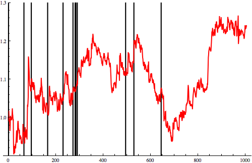
This chart shows DIS alpha in red. The black lines are days when Disney’s Wikipedia article had more than 14 edits. I might be going insane after spending too long thinking about Wikipedia article edit frequencies but I think some of them do seem to match with large up and down swings. Let’s see what this graph looks like with the second most frequently-edited stock, IBM:
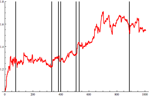
Well this is a lot more interesting! Of the 7 days where there were more than 14 Wikipedia article edits, 5 preceded sharp falls or rises and 2 came right after sharp falls or rises. What’s most interesting here is how predictive they seem to be of sharp changes in the market. Let’s have a look at the last one on the far right and see what happened there. Inspecting the event on Google Finance, showed me that IBM fell 9.8% from July 4 to July 8, while the Dow Jones fell only 2.5% in the same period. It then returned as quickly and by July 19 was back at it’s July 4 price. Here’s what happened on Wikipedia during the same period
2012-07-01:  1 edit
2012-07-02:  4 edits
2012-07-05:  3 edits
2012-07-10:  1 edit
2012-07-12: 17 edits
2012-07-14:  2 edits
2012-07-16:  1 edit
2012-07-17:  2 edits
Oh woe is me! The predictive power I’d hoped for isn’t there. Edits didn’t spike until IBM hit bottom. In fact, looking through the Wikipedia history entries reveals the edits were all vandalism and the clearing up of vandalism. Perhaps one of the other spikes will reveal something more interesting. Let’s look at the following spike which I’ve marked with blue arrows on this chart:
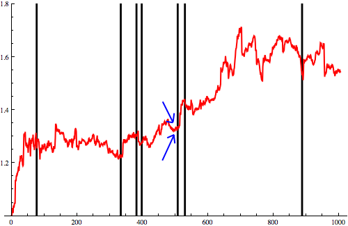
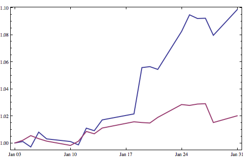
This happened on the 7th of January 2011. In the 20 days the NYSE was open in January 2011, IBM (blue) did this and the Dow Jones (purple) did this:
Lets see if the Wikipedia edits reveal what was afoot. Of the edits that took place on January 7th 2011, this is what they concerned (in order):
1. vandalism
2. vandalism
3. vandalism
4. vandalism
5. vandalism
6. vandalism
7. vandalism
8. vandalism
9. vandalism
10. vandalism
11. vandalism
12. vandalism
13. vandalism
14. vandalism
15. vandalism
16. vandalism
17. vandalism
Damn! At this point I’m 99% certain this mini-project has confirmed the null hypothesis and I’m getting a little too dejected to continue. Of course what might be happening is that just before a product launch or large event, companies closely monitor their wiki pages as they prepare for the ensuing PR campaign. This means that vandalism is noticed and fixed quickly, the vandals respond, getting involved in an edit war with company employees - increasing the wikipedia edits, and revealing the warming up of the PR machine! I’ll see if I can scour the news to find what did happen at IBM to push the share price so high so quickly - back in a minute.
Here’s my theory: you probably remember this - it turns out that this was when all the hype about IBM’s Watson super-computer that could play Jeopardy! started to pick up. The first actual televised competition itself happened later on February 14, 2011. Coincidence? Maybe. IBM did have other news around that time, but Watson was definitely that story that reminded people that there was a tech company called IBM.
Do I think Wikipedia edits is a realistic trading strategy? - well, perhaps, but you’re going to be wrong, er, quite often - and even if the vandalism theory is true, you won’t be certain if what’s coming is good or bad news - so I’ll stick to my day job for now. In any case, I’ve given you all the tools you need, good luck!